
You opened LinkedIn, looked for the carousel button, and it was gone. Nothing is broken on your account. LinkedIn removed the dedicated carousel option in June 2023, and the LinkedIn carousel format itself never left.
A LinkedIn carousel today is a multi-page document you upload as a PDF. Each page becomes a swipeable slide your audience moves through, exactly like before. The button changed, the result did not. 🎠
Here is what this guide covers, in the order you need it.
Why the option disappeared and what replaced it.
The exact steps to post one today, with the current interface.
Sizes, formats and limits, in one table.
What separates a carousel people read from one they scroll past.
Carousel Ads, which are still native inside Campaign Manager.
Does LinkedIn still have carousels?
Yes. What disappeared is the shortcut, not the format. Until then, a dedicated option let you assemble slides inside the post editor. LinkedIn retired it and folded the same result into document posts.
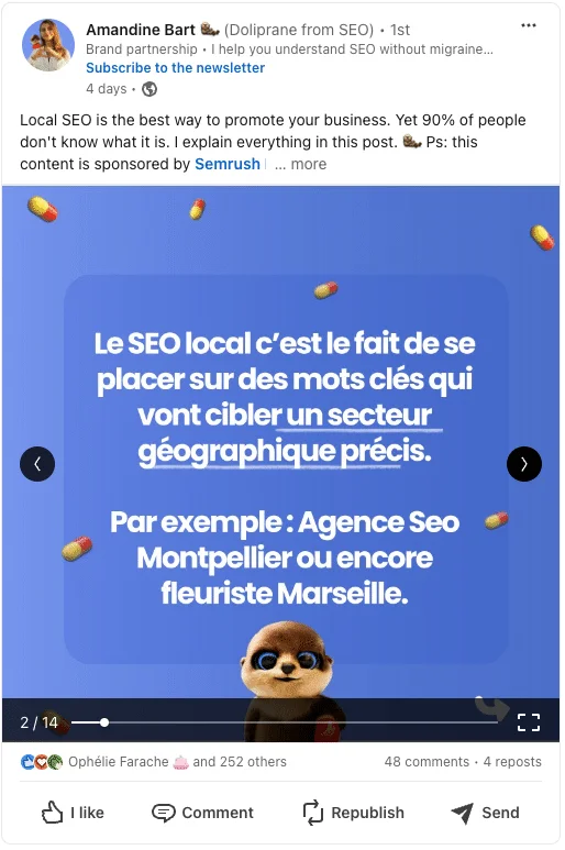
So a LinkedIn carousel is now defined by what your audience sees, a set of slides in the feed, and no longer by the button you click to build it. If you upload a five page PDF, readers get five slides with swipe arrows on both sides.
What changed | Before the change | Today |
|---|---|---|
How you create it | Dedicated carousel option in the post editor | Upload a multi-page document |
File you prepare | Images added one by one | One PDF, PPTX or DOCX |
What readers see | Swipeable slides | Swipeable slides, unchanged |
Where it still exists natively | Organic posts and ads | Carousel Ads in Campaign Manager only |
That last row matters more than it looks. Two different objects share the same name, and confusing them is the most common mistake we see. The organic version goes through a document. The advertising version kept its own builder, and we come back to it at the end.
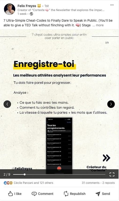
Why post a LinkedIn carousel?
Because it buys attention. A text post is read in three seconds. A carousel asks for a swipe, then another, and each swipe tells the algorithm that someone stayed. Dwell time is one of the signals that decides who sees you next, which is why the format survived the removal of its own button.
Concretely, a carousel works well when you want to:
Turn a long idea into something readable on a phone.
Show a process step by step, one slide per step.
Repurpose a blog article or a webinar without rewriting it.
Get profile visits from people who finished all the slides.
Put a portfolio, a case study or a set of numbers in front of prospects.
It is also the cheapest format to test against what you already publish. If you want the full picture of what performs on the platform, our overview of writing a post on LinkedIn compares every format side by side.
Format | Effort | Best for | Weak spot |
|---|---|---|---|
Text post | Low | Opinions, quick stories | Disappears fast |
Image post | Medium | One idea, one visual | Nothing to swipe |
Carousel | Medium to high | Step by step, teaching, portfolios | Dies if slide 1 is weak |
Video | High | Demos, faces, storytelling | Production time |
None of this replaces posting consistently. The format gives you a better shot at reach, timing does the rest, and our data on the best time to post on LinkedIn shows how much that second variable moves.
How to post a carousel on LinkedIn
Four steps, and the only tricky part is knowing that you are looking for a document, not a carousel. 👇
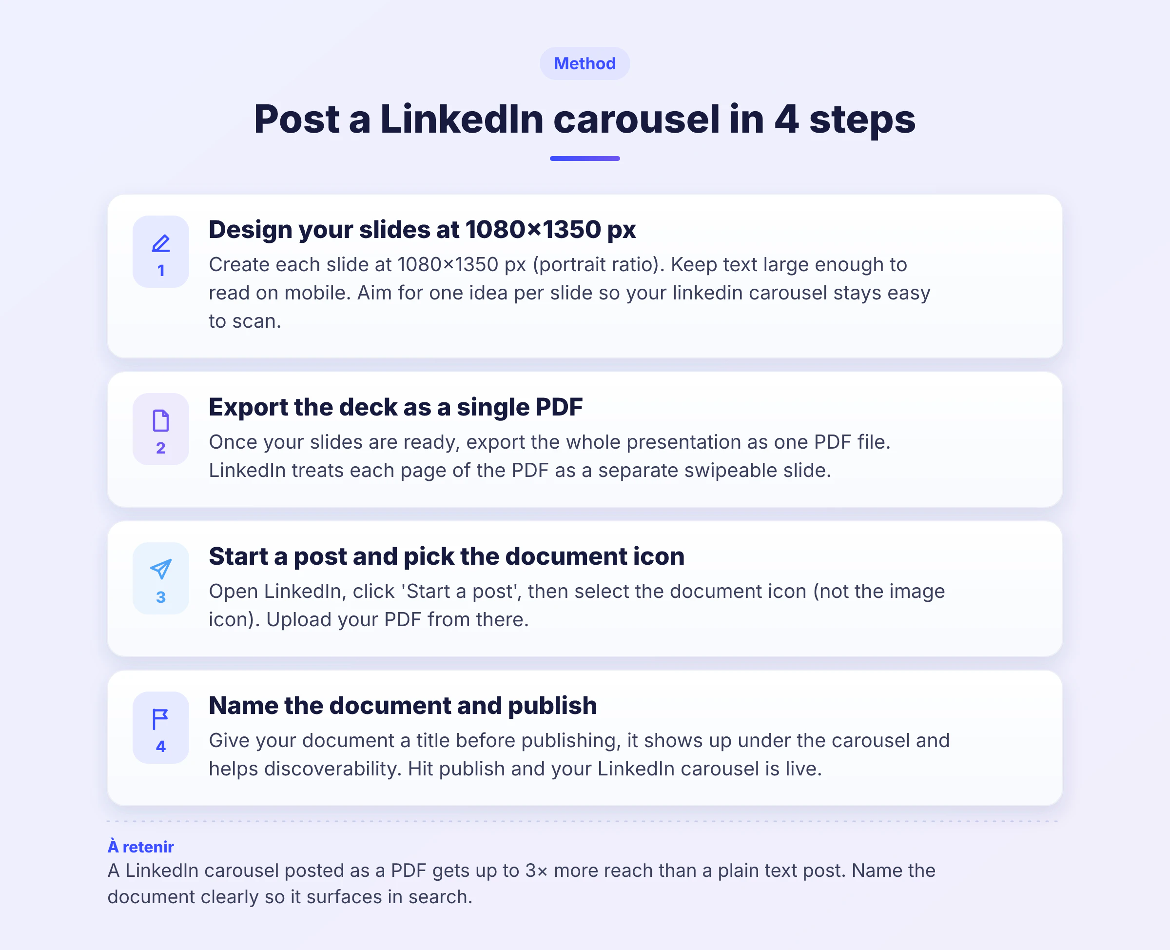
Step 1: design your slides
Build your slides in any design tool, at 1080 x 1350 pixels for the portrait format that takes the most space in a mobile feed. One idea per slide, and resist the urge to fill the whole surface with text.
Step 2: export one multi-page PDF
Export everything as a single PDF, in RGB. Each page becomes a slide, in the order of your document, so check that order before you export. A missing page is a broken story.
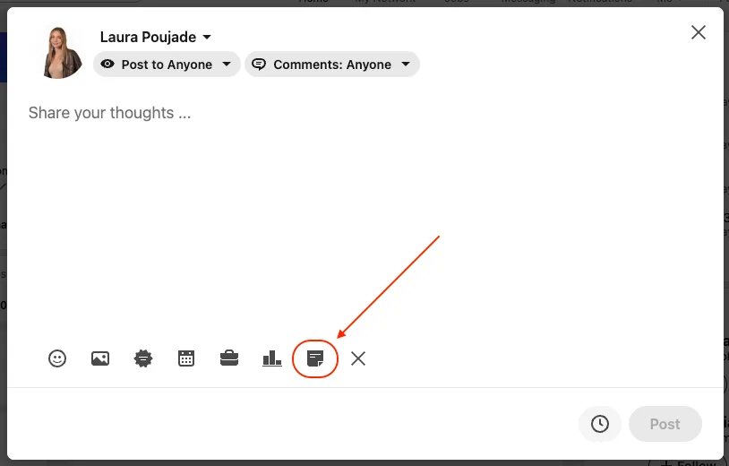
Step 3: start a post and pick the document icon
On your feed, click Start a post, then open the media options and choose to add a document. This is where people give up, because they are scanning for the word carousel and it is not there.
Step 4: name the document and publish
LinkedIn asks for a document title. It shows on the carousel itself, so treat it as a second headline rather than a file name. Untitled document is the fastest way to lose readers who were about to swipe.
Write your post text above it, add one or two hashtags on LinkedIn if they fit your topic, and publish. If you would rather queue it for a better slot, our guide on how to schedule a post on LinkedIn covers the native scheduler and its limits.
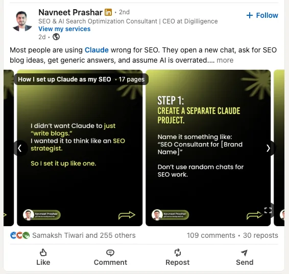
LinkedIn carousel size, format and limits
These are the specs worth keeping in a bookmark. The 4:5 ratio is the one that earns the most screen space, and the file ceiling is far higher than anything you will actually need.
Setting | Recommended | Notes |
|---|---|---|
Dimensions | 1080 x 1350 px (4:5) | Portrait, takes the most room on mobile |
Alternative | 1080 x 1080 px (1:1) | Square, safer if you repurpose from Instagram |
File format | PPTX and DOCX are accepted and converted | |
Colour mode | RGB | CMYK exports can shift on screen |
Number of slides | 5 to 12 | Sweet spot for completion, the platform allows far more |
File size | Under 5 MB | A clean 10-slide deck rarely goes above that |
Post text | 150 to 200 characters before the cut | What readers see before clicking see more |
Two numbers deserve a comment. Slide count first, because more slides do not mean more reach: completion rate drops with length, and a tight eight-slide deck beats a twenty-slide one almost every time. Post text second, since that is the hook that decides whether anyone swipes at all. If you want to control exactly where your text breaks, our piece on LinkedIn post character limits explains where each cut-off sits.
What makes a LinkedIn carousel work
The mechanics above take ten minutes to learn. What separates a carousel that travels from one that sinks is the first slide and the rhythm after it. 🎯
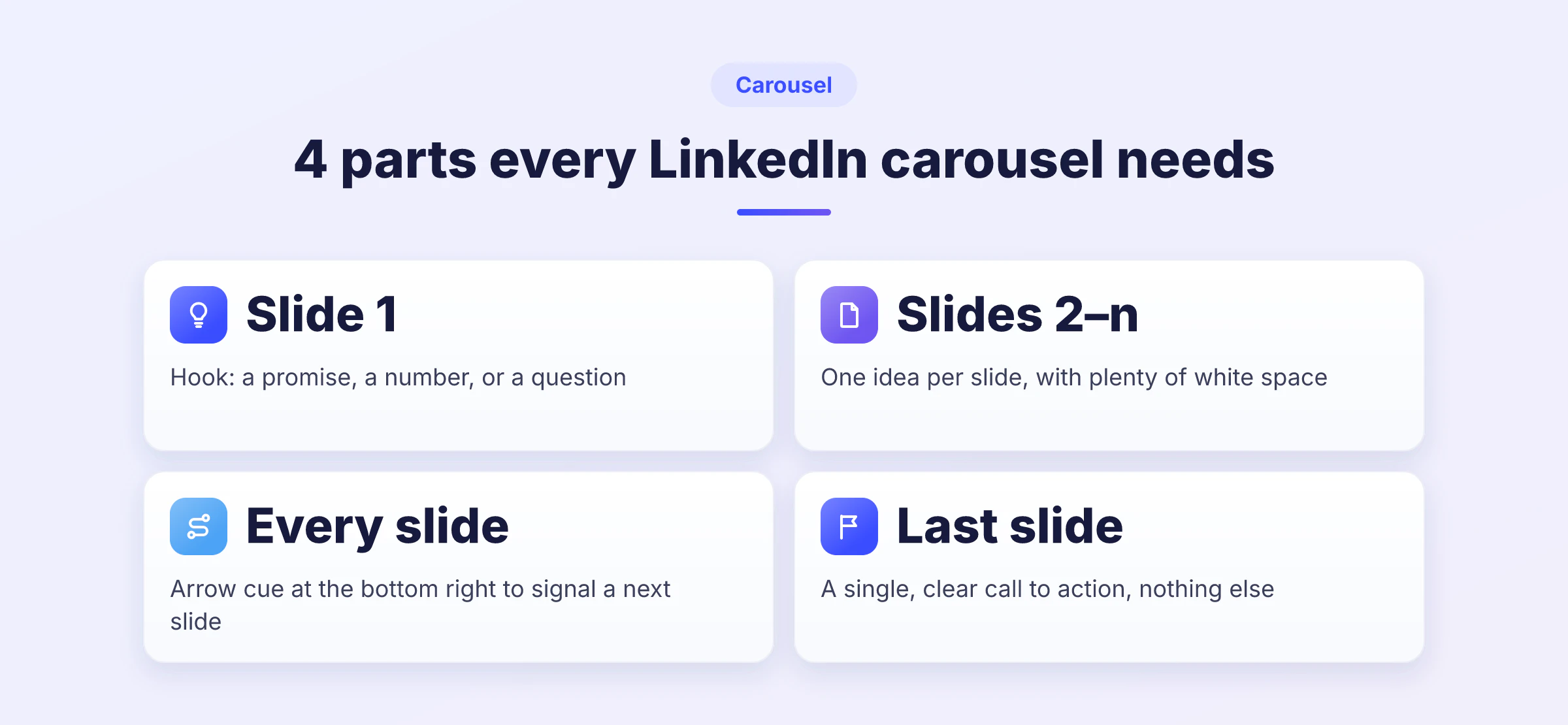
Slide 1 carries the whole post. It needs a promise the reader can weigh in one second, a number, a claim or a question. Everything after it only has to keep the promise, one idea per slide, with enough white space that nobody has to squint.
The checklist we use before publishing:
Slide 1 states what the reader gets, not who you are.
One idea per slide, never two.
A visual cue at the bottom right so the swipe feels obvious.
Consistent typography and colours across every slide.
A last slide with exactly one call to action.
Your first comment is part of the format too. Drop the link there rather than in the post, and answer everyone in the first hour, because replies feed the same signals that likes and comments on LinkedIn already influence.
Tools and templates to build your slides
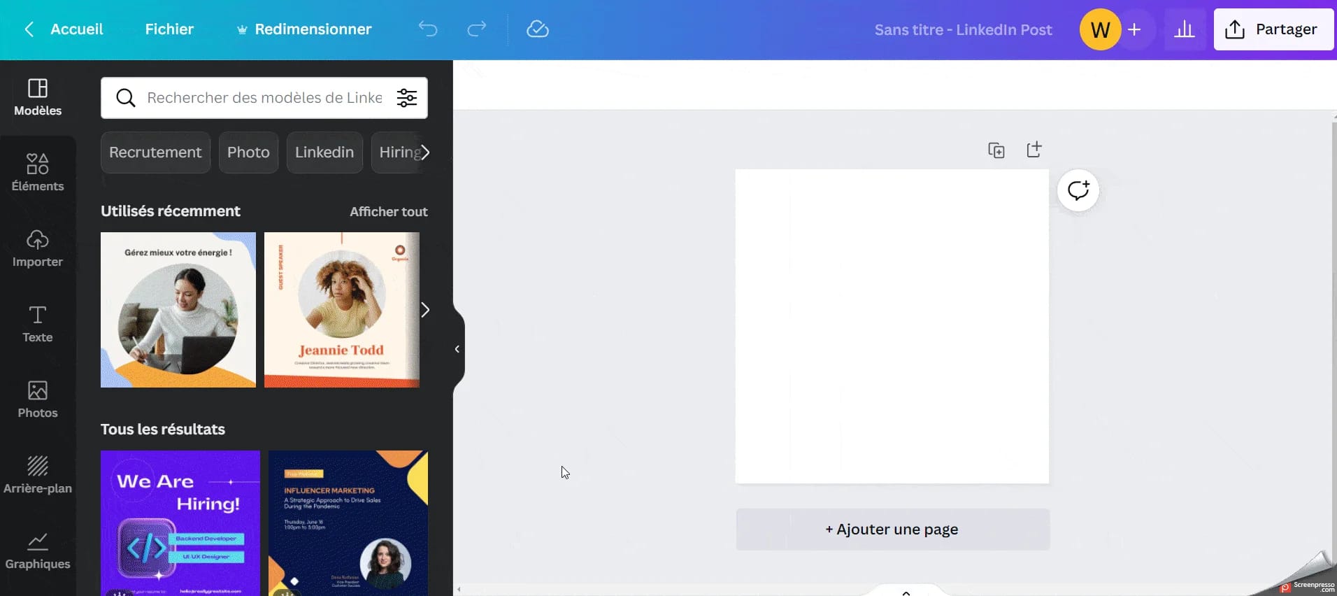
You do not need a designer. Canva covers the whole job for free: pick a LinkedIn post size, build your pages, then export to PDF. Figma is the better option if you already work in it or want a reusable template for your team.
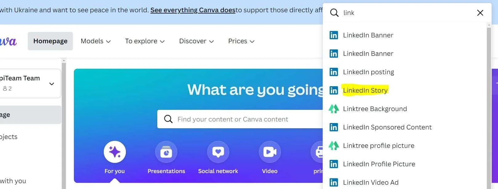
From there you pick the typography, the shapes and the colours, and you can upload your own assets. Keep one template and reuse it, because a recognisable visual identity does more for reach over three months than any single clever slide.
Short on ideas rather than on tools? A LinkedIn post generator gets you a first draft you can split into slides, and our list of prompts for LinkedIn posts does the same job if you write with an AI assistant.
LinkedIn Carousel Ads: the version that kept its button
Here is the part that confuses everyone. Inside Campaign Manager, carousels never went anywhere. They are a paid ad format with their own builder, their own specs and their own targeting. 💰
Criterion | Organic carousel | Carousel Ads |
|---|---|---|
How you build it | Multi-page document | Native builder in Campaign Manager |
Number of cards | 5 to 12 slides recommended | 2 to 10 cards |
Dimensions | 1080 x 1350 px | 1080 x 1080 px minimum, 1:1 |
Call to action | Text and first comment | A real CTA button per card |
Audience | Your network and its reach | Job title, seniority, company size, industry |
Cost | Your time | Budget per click or impression |
Paid carousels suit one specific job, telling a sequence to people who have never heard of you, with a button at every step. The objectives available are brand awareness, website visits, lead generation and website conversions.
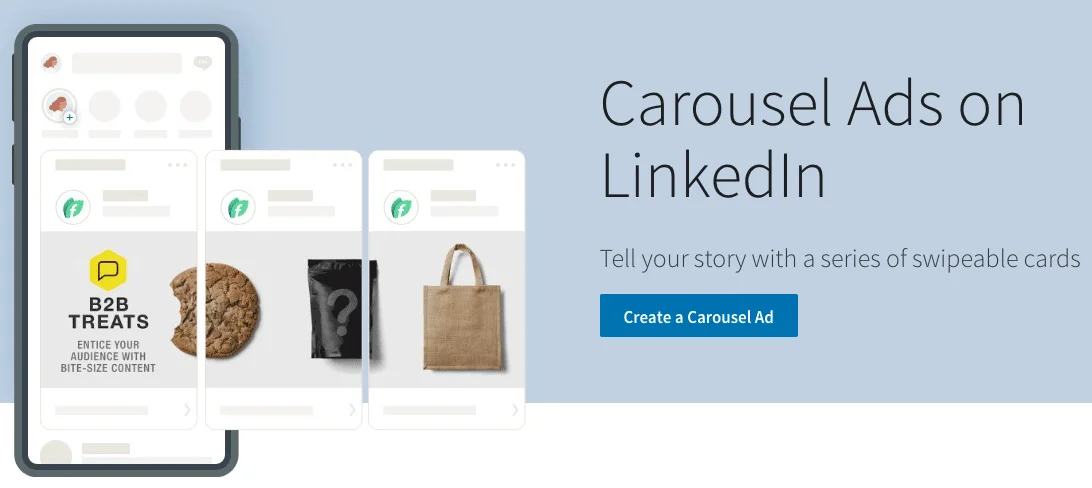
Before you put budget behind it, make sure the organic version already gets replies. An ad amplifies a message that works and wastes money on one that does not. The full setup, bidding included, is in our LinkedIn Ads guide.
Carousels get you seen. What you do with the people who engage is a separate job, and that is where a tool like Waalaxy takes over: import the profiles that reacted to your post, then run a multi-channel sequence of profile visit, invitation and prospecting message from one queue. The trial runs 14 days without a card.
LinkedIn carousel: what to remember
The LinkedIn carousel outlived its own button. The dedicated option went away in June 2023, document posts replaced it, and the reading experience your audience gets is identical. Anyone still looking for a missing feature is simply looking in the wrong menu.
So the recipe is short. Design at 1080 x 1350, export one PDF, upload it as a document, give it a title worth reading, and spend most of your effort on slide 1. Publish two or three this month against your usual posts and compare. The format rewards the people who actually try it, not the ones who wait for the button to come back.
FAQ: LinkedIn carousel
Because LinkedIn removed it in June 2023 for every account at once. It is not a bug, a regional rollout or something tied to your plan, and no setting brings it back.
The replacement is the document post. Upload a multi-page PDF and each page becomes a slide readers swipe through, which is what the old option produced anyway. The only thing you lose is the ability to assemble slides inside LinkedIn itself, so you now prepare them in Canva, Figma or any tool that exports a PDF.
Use 1080 x 1350 pixels, a 4:5 portrait ratio. It occupies the most vertical space in a mobile feed, which pushes competing content off the screen while someone reads yours.
Square at 1080 x 1080 also works and is convenient when you repurpose visuals from Instagram. Avoid the horizontal ratio, it shrinks to a thin strip on a phone. Export in RGB rather than CMYK so your colours look the same on screen as in your design tool.
Between 5 and 12. Under five, the format has no time to build anything and adding an image to a LinkedIn post would do the same job. Past twelve, completion drops sharply and the last slides, where your call to action sits, are seen by almost nobody.
The platform lets you upload far more pages than that, so the limit is attention, not technology. If your subject genuinely needs twenty slides, it probably needs to become two carousels or a LinkedIn article instead.
Yes, the document option exists on mobile, but the PDF has to already be on your phone and reachable from the file picker. In practice most people prepare on desktop and publish on desktop, simply because you see the full layout before it goes live.
If you build on mobile anyway, export from Canva to your device first, then start a post and pick the document option exactly as you would on a computer.
Yes. The native scheduler accepts document posts like any other, so you upload your PDF, write your text and pick a slot instead of publishing immediately.
Two caveats worth knowing before you rely on it. You cannot edit a scheduled post in place, you delete it and start over, and the preview is less reliable than on a live post. Our guide to scheduling posts on LinkedIn lists what the native tool handles and where third-party tools still help.
The organic carousel is free, built from a document, and reaches your network and whoever the algorithm decides to show it to. The Carousel Ad is paid, built inside Campaign Manager, and reaches an audience you define by job title, seniority, company size or industry.
They also differ in shape. An ad runs from 2 to 10 cards at 1080 x 1080, and every card carries its own button, which the organic version cannot do. Use the free one to test what your audience reacts to, then put budget behind the message that already earned replies. You can check what worked with your LinkedIn engagement rate.